Consistent, place based,
yet contemporary.
Miaotea is a boba and tea brand rooted in Chongming, Shanghai,
a quieter, more residential area distinct from the city’s dense
urban core. The brand draws from the region’s calm rhythms,
open landscapes, and everyday rituals of tea.
sole designer
Photoshop
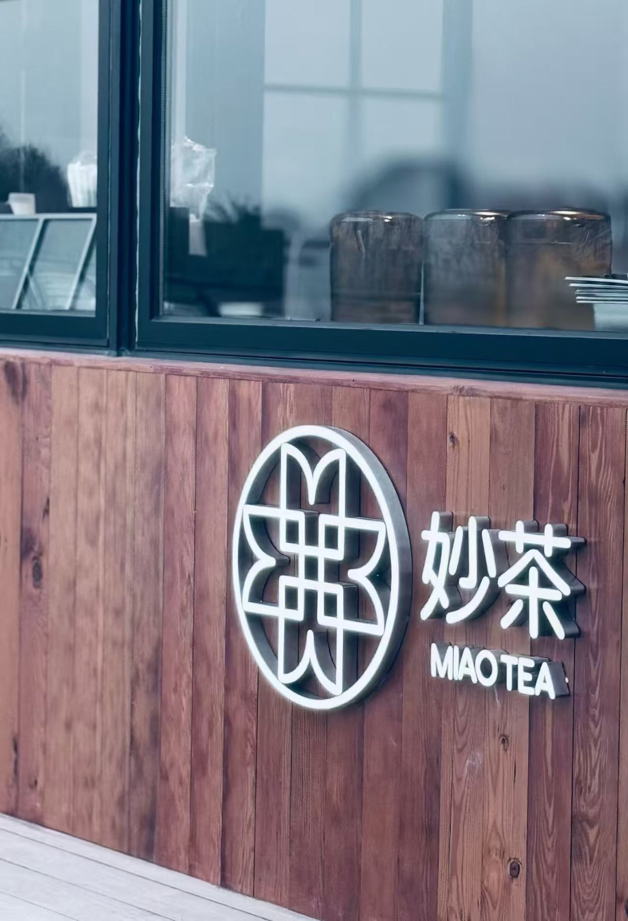
Storefront
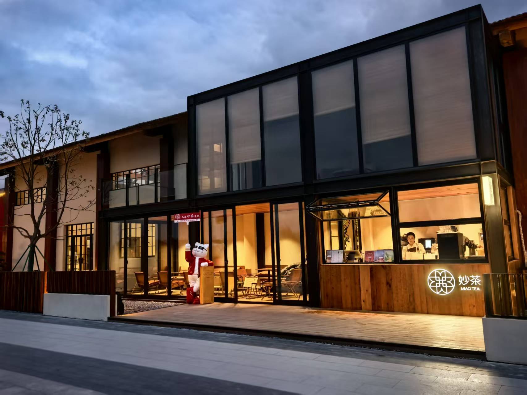
This project was really special to me because Chongming is my mother’s hometown, and a place I visited often growing up. The branding draws from both local culture and the existing architecture of the storefront, using form, proportion, and restraint to reflect the environment.
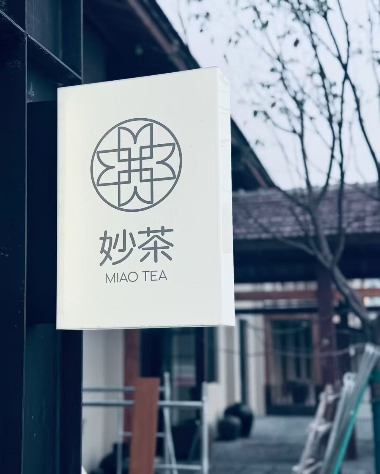
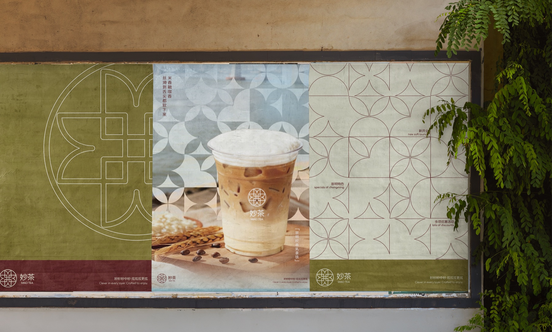
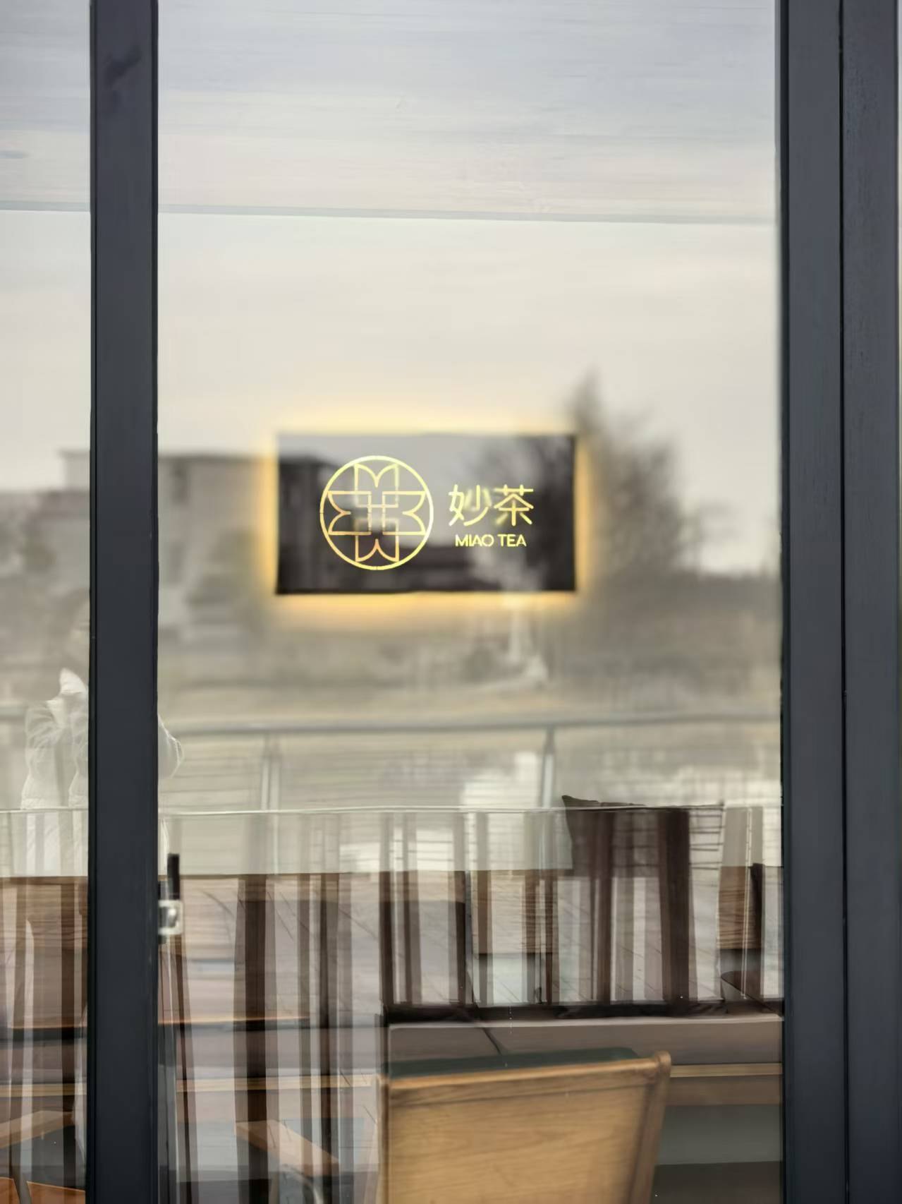
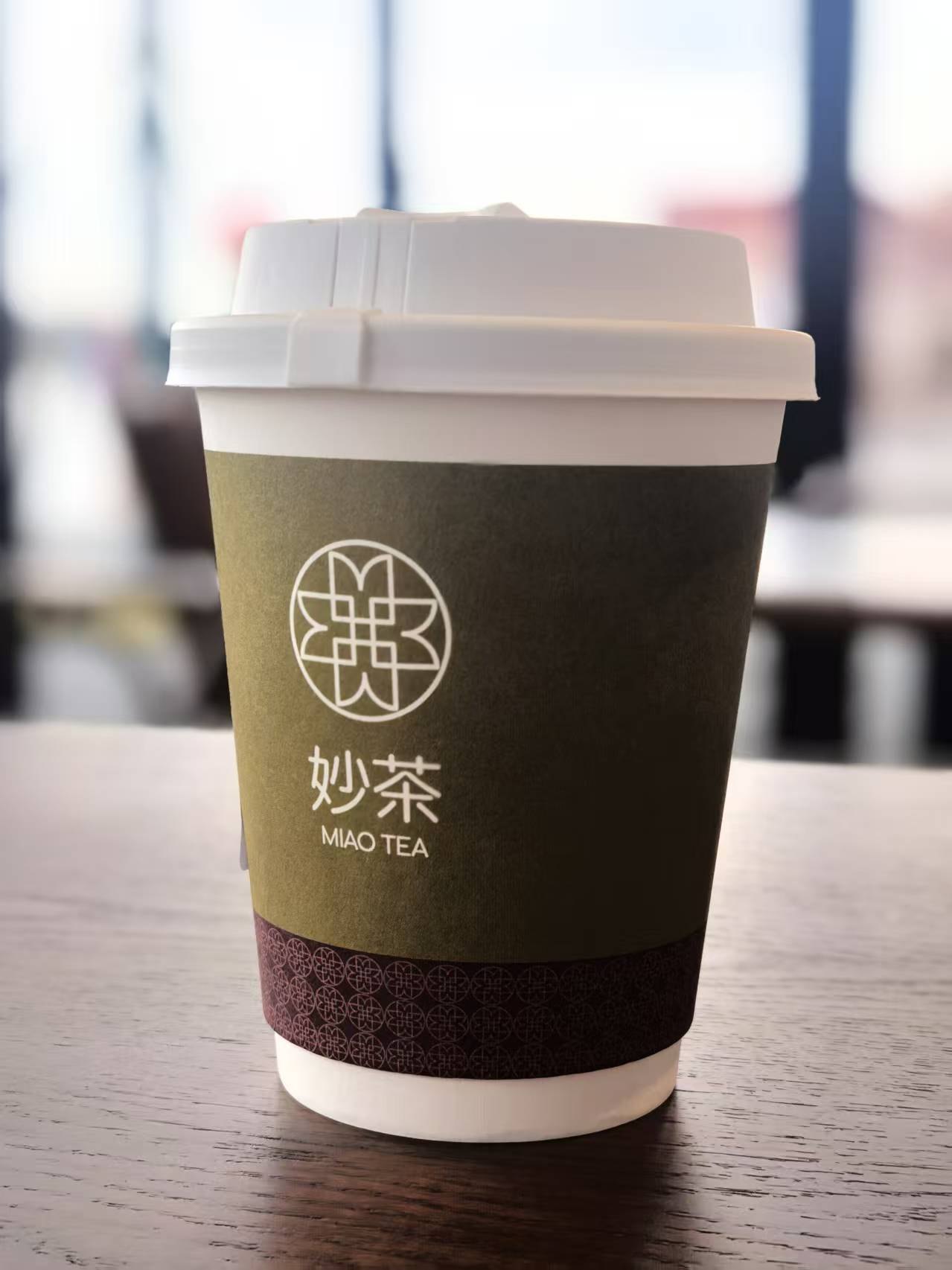
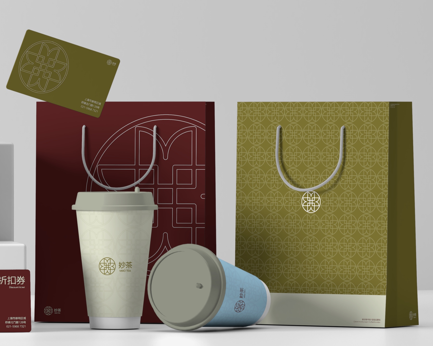
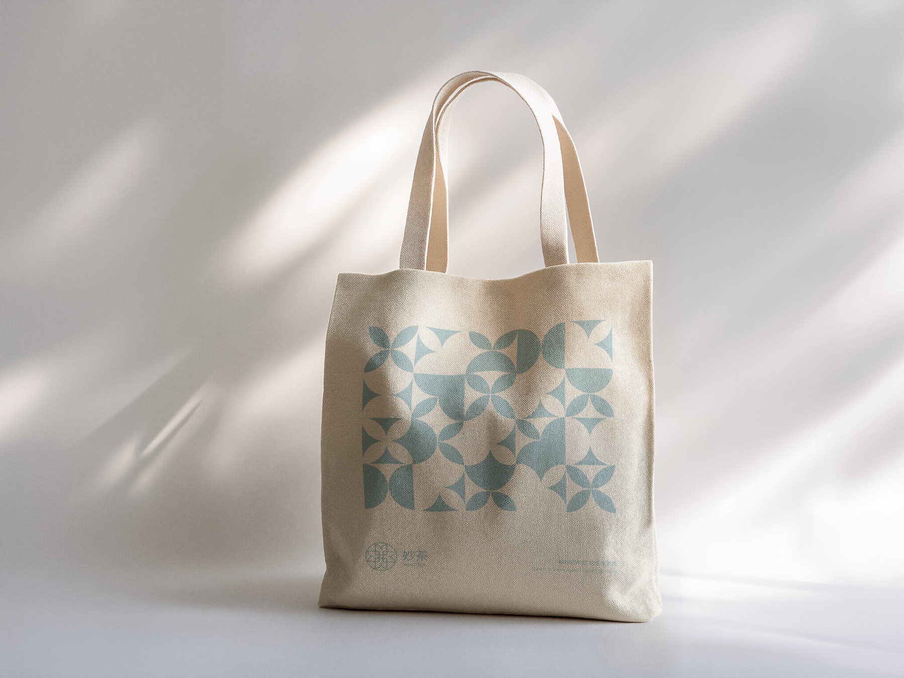
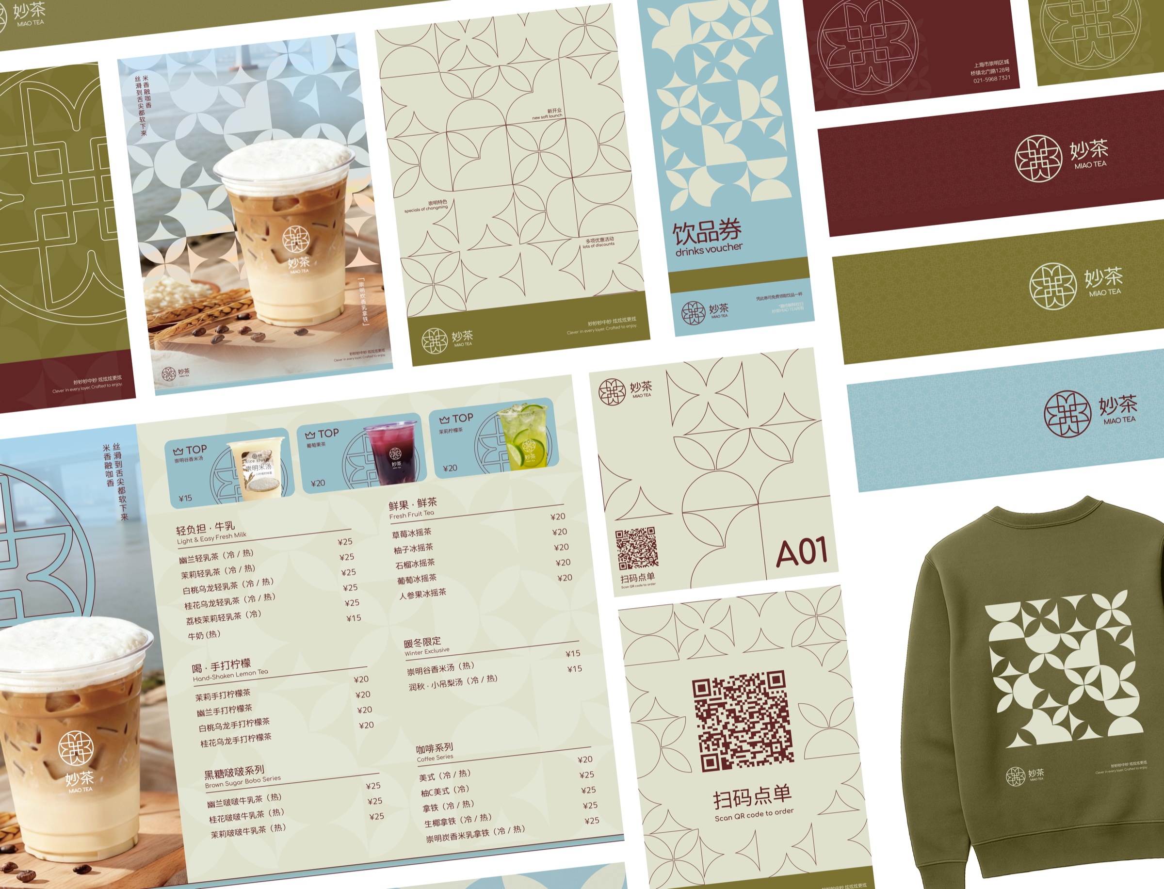
One mark, one grid, and four colours, carried from the blade sign on the street to the loyalty card in a pocket.
System
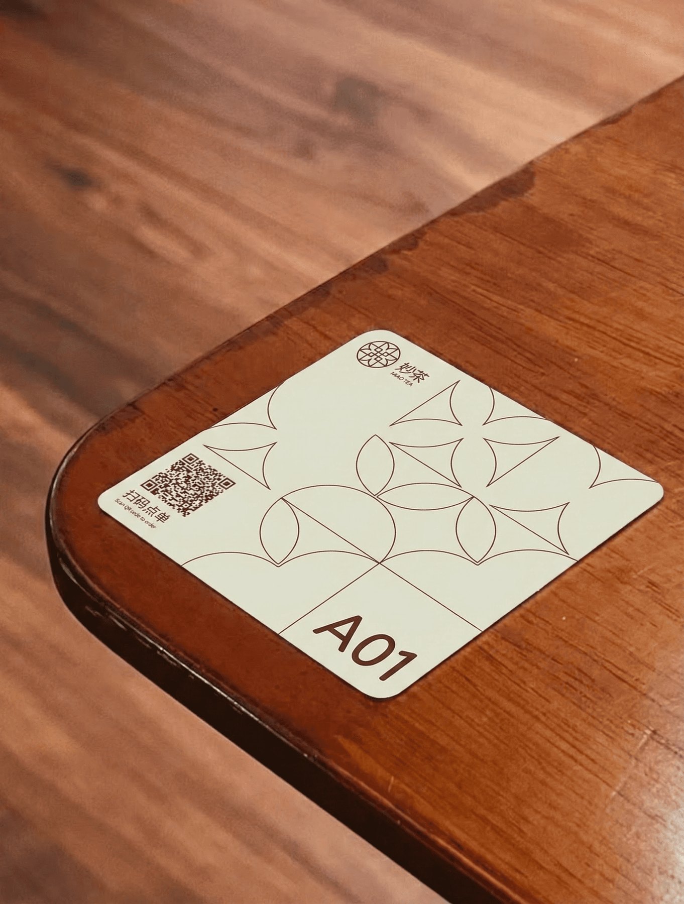
The M is drawn once, then squared, quartered and tiled. The letterform is cut down to one square tile; rotating and mirroring that tile builds both the roundel and the surface pattern, so the mark and the pattern are the same construction at two sizes.
Four colours, from the brick of the signage to the paper the rest is printed on.
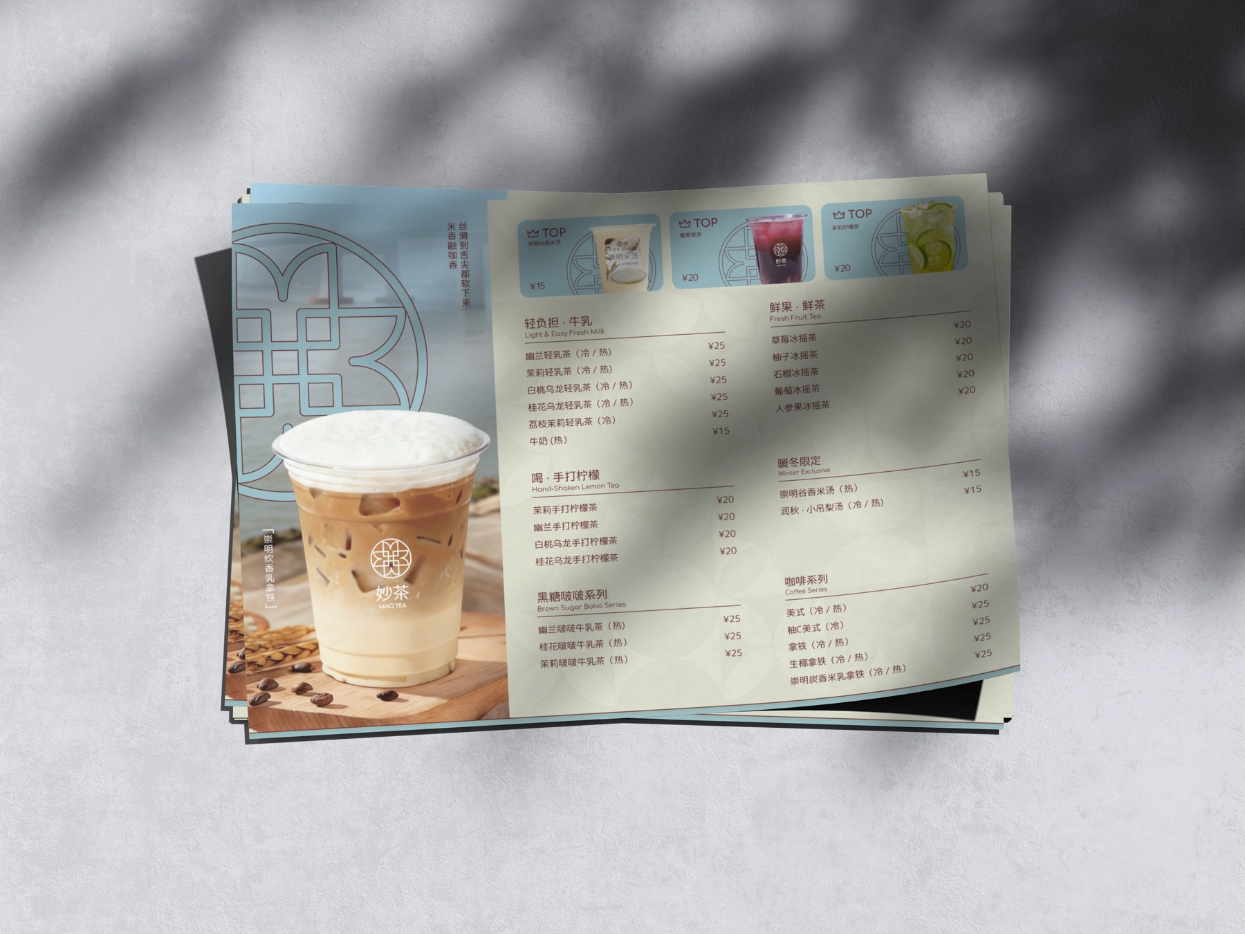
Print & packaging
Reflection
Miaotea let me lead a full brand system from concept through production as a sole designer. Designing for Chongming, my mother’s hometown, grounded every decision in care, restraint, and respect for place.